In this assessment, you’ll apply pandas and seaborn to process and visualize education statistics.
# For testing purposes
from matplotlib.patches import Rectangle
from pandas.testing import assert_series_equal

import pandas as pd
import seaborn as sns

sns.set_theme()
The National Center for Education Statistics is a U.S. federal government agency for collecting and analyzing data related to education. We have downloaded and cleaned one of their datasets Percentage of persons 25 to 29 years old with selected levels of educational attainment, by race/ethnicity and sex: Selected years, 1920 through 2018 into the nces-ed-attainment.csv file.
The nces_ed_attainment.csv file has the columns Year, Sex, Min degree, and percentages for each subdivision in the specified year, sex, and min degree. The data is represented as a pandas DataFrame with the following MultiIndex:
Yearis the first level of theMultiIndexwith values ranging from 1920 to 2018.Sexis the second level of theMultiIndexwith valuesFfor female,Mfor male, orAfor all students.Min degreeis the third level of theMultiIndexwith values referring to the minimum degree of educational attainment:high school,associate's,bachelor's, ormaster's.
and columns:
Totalis the overall percentage of the givenSexpopulation in theYearwith at least theMin degreeof educational attainment.White,Black,Hispanic,Asian,Pacific Islander,American Indian/Alaska Native, andTwo or more racesis the percentage of students of the specified racial category (and of theSexin theYear) with at least theMin degreeof educational attainment.
Missing data is denoted by NaN (not a number).
data = pd.read_csv(
    "nces_ed_attainment.csv",
    na_values=["---"],
    index_col=["Year", "Sex", "Min degree"]
).sort_index(level="Year", sort_remaining=False)
data
The cell above reads nces_ed_attainment.csv and replaces all occurrences of the str --- with pandas NaN to help with later data processing steps. By defining a MultiIndex on the columns Year, Sex, and Min degree, we can answer questions like “What is the overall percentage of those who have at least a high school degree in the year 2018?” with the following df.loc[index, columns] expression.
data.loc[(2018, "A", "high school"), "Total"]Instructions: For this assessment, instead of writing test cases, we’ll only be working with the educational attainment dataset described above. We’ve provided one test case for each function that includes the exact expected values for each function. Instead of extending the test cases, you’ll be asked to write-up and reason about the quality of work demonstrated in each task. Please also write your own docstring for each function.
Since we use assertion-based tests in this assessment, as long as there are no assertion errors you can consider all tests passed.
Outside Sources
Update the following Markdown cell to include your name and list your outside sources. Submitted work should be consistent with the curriculum and your sources.
Name: YOUR_NAME_HERE
Enter your outside sources as a list here, or remove this line if you did not consult any outside sources at all.
Task: Compare bachelor’s in a given year
Write a function compare_bachelors_year that takes the educational attainment data and a year and returns a two-row Series that indicates the percentages of persons with listed sex "M" or "F" who achieved at least a bachelor’s degree in the given year.
def compare_bachelors_year(data, year):
    ...


output = compare_bachelors_year(data, 1980)
display(output)
assert_series_equal(output, pd.Series([24., 21.], name="Total",
    index=pd.MultiIndex.from_product([[1980], ["M", "F"], ["bachelor's"]], names=data.index.names)
))
Task: Mean min degree between given years for a given category
Write a function mean_min_degrees that takes the educational attainment data, a start_year (default None), an end_year (default None), a string category (default "Total") and returns a Series indicating, for each Min degree within the given years, the average percentage of educational attainment for people of the given category between the start_year and the end_year for the sex A. When start_year or end_year is None, consider all rows from either the beginning or end of the dataset (respectively).
def mean_min_degrees(data, start_year=None, end_year=None, category="Total"):
    ...


output = mean_min_degrees(data, start_year=2000, end_year=2009)
display(output)
assert_series_equal(output, pd.Series([38.366667, 29.55, 87.35, 6.466667], name="Total",
    index=pd.Index(["associate's", "bachelor's", "high school", "master's"], name="Min degree")
))
Writeup: Debugging NaN values
While writing test cases, one of your coworkers noticed that some calls to mean_min_degrees produce NaN values and wanted your opinion on whether or not this is a bug with the function. Using the data source, explain why a NaN value appears in the result of the following code cell.
TODO: Replace this text with your answer.
mean_min_degrees(data, category="Pacific Islander")Task: Line plot for total percentage for the given min degree
Write a function line_plot_min_degree that takes the educational attainment data and a min degree and returns the result of calling sns.relplot to produce a line plot. The resulting line plot should show only the Total percentage for sex A with the specified min degree over each year in the dataset. Label the x-axis “Year”, the y-axis “Percentage”, and title the plot “Min degree for all bachelor’s” (if using bachelor’s as the min degree).
def line_plot_min_degree(data, min_degree):
    ...


ax = line_plot_min_degree(data, "bachelor's").facet_axis(0, 0)
assert [tuple(xy) for xy in ax.get_lines()[0].get_xydata()] == [
    (1940,  5.9), (1950,  7.7), (1960, 11.0), (1970, 16.4), (1980, 22.5), (1990, 23.2),
    (1995, 24.7), (2000, 29.1), (2005, 28.8), (2006, 28.4), (2007, 29.6), (2008, 30.8),
    (2009, 30.6), (2010, 31.7), (2011, 32.2), (2012, 33.5), (2013, 33.6), (2014, 34.0),
    (2015, 35.6), (2016, 36.1), (2017, 35.7), (2018, 37.0),
], "data does not match expected"
assert all(line.get_xydata().size == 0 for line in ax.get_lines()[1:]), "plot has more than 1 line"
assert ax.get_title() == "Min degree for all bachelor's", "title does not match expected"
assert ax.get_xlabel() == "Year", "x-label does not match expected"
assert ax.get_ylabel() == "Percentage", "y-label does not match expected"
Task: Bar plot for high school min degree percentage by sex in a given year
Write a function bar_plot_high_school_compare_sex that takes the educational attainment data and a year and returns the result of calling sns.catplot to produce a bar plot. The resulting bar plot should compare the total percentages of Sex A, M, and F with high school Min degree in the given year. Label the x-axis “Sex”, the y-axis “Percentage”, and title the plot “High school completion in 2009” (if using 2009 as the year).
def bar_plot_high_school_compare_sex(data, year):
...
ax = bar_plot_high_school_compare_sex(data, 2009).facet_axis(0, 0)
assert sorted(rectangle.get_height() for rectangle in ax.findobj(Rectangle)[:3]) == [
87.5, 88.6, 89.8,
], "data does not match expected"
assert len(ax.findobj(Rectangle)) == 4, "too many rectangles drawn" # ignore background Rectangle
assert ax.get_title() == "High school completion in 2009", "title does not match expected"
assert ax.get_xlabel() == "Sex", "x-label does not match expected"
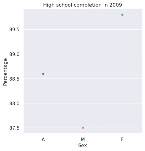
assert ax.get_ylabel() == "Percentage", "y-label does not match expected"Writeup: Bar plot versus scatter plot
Read Kieran Hiely’s comparison of bar plot versus scatter plot from Data Visualization section 1.6: Problems of honesty and good judgment.
Compare your bar plot for high school completion in 2009 to the scatter plot below.
Answer the question: Which plot do you prefer and why?
TODO: Replace this text with your answer.
Task: Plot for min degree percentage over time for a given racial category
Write a function plot_race_compare_min_degree that takes the educational attainment data and a string category and returns the result of calling the sns plotting function that best visualizes this data. The resulting plot should compare each of the 4 Min degree options, indicating the percentage of educational attainment for the given racial category, sex A, and given Min degree over the entire time range of available data. Due to missing data, not all min degree options will stretch the entire width of the plot. Label the x-axis “Year”, the y-axis “Percentage”, and title the plot “Min degree for Hispanic” (if using Hispanic as the racial category).
def plot_race_compare_min_degree(data, category):
    ...


ax = plot_race_compare_min_degree(data, "Hispanic").facet_axis(0, 0)
assert sorted([tuple(xy) for xy in line.get_xydata()] for line in ax.get_lines()[:4]) == [
    [(1980,  7.7), (1990,  8.1), (1995,  8.9), (2000,  9.7), (2005, 11.2), (2006,  9.5),
     (2007, 11.6), (2008, 12.4), (2009, 12.2), (2010, 13.5), (2011, 12.8), (2012, 14.8),
     (2013, 15.7), (2014, 15.1), (2015, 16.4), (2016, 18.7), (2017, 18.5), (2018, 20.7)],
    [(1980, 58.0), (1990, 58.2), (1995, 57.1), (2000, 62.8), (2005, 63.3), (2006, 63.2),
     (2007, 65.0), (2008, 68.3), (2009, 68.9), (2010, 69.4), (2011, 71.5), (2012, 75.0),
     (2013, 75.8), (2014, 74.7), (2015, 77.1), (2016, 80.6), (2017, 82.7), (2018, 85.2)],
    [                            (1995,  1.6), (2000,  2.1), (2005,  2.1), (2006,  1.5),
     (2007,  1.5), (2008,  2.0), (2009,  1.9), (2010,  2.5), (2011,  2.7), (2012,  2.7),
     (2013,  3.0), (2014,  2.9), (2015,  3.2), (2016,  4.1), (2017,  3.9), (2018,  3.4)],
    [                            (1995, 13.0), (2000, 15.4), (2005, 17.3), (2006, 16.1),
     (2007, 18.1), (2008, 18.7), (2009, 18.4), (2010, 20.5), (2011, 20.6), (2012, 22.7),
     (2013, 23.1), (2014, 23.4), (2015, 25.7), (2016, 27.0), (2017, 27.7), (2018, 30.5)],
], "data does not match expected"
assert all(line.get_xydata().size == 0 for line in ax.get_lines()[4:]), "plot has more than 4 lines"
assert ax.get_title() == "Min degree for Hispanic", "title does not match expected"
assert ax.get_xlabel() == "Year", "x-label does not match expected"
assert ax.get_ylabel() == "Percentage", "y-label does not match expected"
Task: Line plot comparing educational attainment by race over time
Write a function line_plot_compare_race that takes the educational attainment data and a min degree and returns the result of calling sns.relplot to produce a line plot comparing educational attainment for the given Min degree across all races (excluding Total and Two or more races) for sex A beginning in the year 2009. The x-axis should have label “Year”, the y-axis “Percentage”, and the plot title should be “Attainment by race for all associate’s” (if using associate’s as the min degree).
The way we’ve learned to create plots in seaborn assumes long-form data where each column represents a different variable, so all our prior tasks have produced plots that only look at a single race (or Total). To create a line plot where each column gets its own line, we can simply leave the parameters x, y, and hue unspecified, such as in:
sns.relplot(data, kind="line")If you run into a TypeError: Invalid object type while plotting the wide-form data, that’s seaborn’s way of letting you know it doesn’t know how to plot a MultiIndex with more than one level as the x-axis. Call droplevel with a list of level name(s) to remove the given level(s).
def line_plot_compare_race(data, min_degree):
    ...


ax = line_plot_compare_race(data, "associate's").facet_axis(0, 0)
assert sorted([tuple(xy) for xy in line.get_xydata()] for line in ax.get_lines()[:6]) == [
    [(2009, 18.4), (2010, 20.5), (2011, 20.6), (2012, 22.7), (2013, 23.1),
     (2014, 23.4), (2015, 25.7), (2016, 27.0), (2017, 27.7), (2018, 30.5)],
    [(2009, 20.8), (2010, 28.9), (2011, 25.0), (2012, 23.6), (2013, 26.3),
     (2014, 18.2), (2015, 22.3), (2016, 16.5), (2017, 27.1), (2018, 24.4)],
    [(2009, 20.9), (2010, 22.0), (2011, 39.7), (2012, 32.4), (2013, 37.3),
                   (2015, 24.9), (2016, 28.6), (2017, 35.8), (2018, 22.6)],
    [(2009, 27.8), (2010, 29.4), (2011, 29.8), (2012, 31.6), (2013, 29.5),
     (2014, 32.0), (2015, 31.1), (2016, 31.7), (2017, 32.7), (2018, 32.6)],
    [(2009, 47.1), (2010, 48.9), (2011, 50.1), (2012, 49.9), (2013, 51.0),
     (2014, 51.9), (2015, 54.0), (2016, 54.3), (2017, 53.5), (2018, 53.6)],
    [(2009, 66.7), (2010, 63.4), (2011, 64.6), (2012, 68.3), (2013, 67.2),
     (2014, 70.3), (2015, 71.7), (2016, 71.5), (2017, 69.9), (2018, 75.5)],
], "data does not match expected"
assert all(line.get_xydata().size == 0 for line in ax.get_lines()[6:]), "plot has more than 6 lines"
assert ax.get_title() == "Attainment by race for all associate's", "title does not match expected"
assert ax.get_xlabel() == "Year", "x-label does not match expected"
assert ax.get_ylabel() == "Percentage", "y-label does not match expected"
Writeup: Visualizations and persuasive rhetoric
Consider this alternative title for the final programming task: “Asian associate’s attainment reaches new heights”. For the purpose of producing reports and analyses, data programmers will often find themselves needing to choose the type of plot, carry-out data processing tasks (often overlooked yet critical changes to a dataset), and drawing conclusions from those plots to aid readers in interpreting results.
line_plot_compare_race(data, "associate's").set(title="Asian associate's attainment reaches new heights")Browse the Lumina Foundation’s Educational Attainment data dashboard to identify one or more visualizations that can explain how this alternative title might suggest a misleading, incomplete, or otherwise harmful conclusion about racial equity in educational attainment. Describe your explanation and include a link to your selected plot.
TODO: Replace this text with your answer.
To learn more about the design of the data dashboard, read the write-up by Darkhorse Analytics and compare it the write-up by the previous team, Periscopic.