Overview
You will deliver the following:
- Reduced data through any
pre-processing. - Code that will:
- Collect Data (if there is any
web scrapingor use of other tools) - Reduce, Filter and Organize the data
- Test (if you are doing the Unit Test Challenge)
- Collect Data (if there is any
- Sketches of target plots
- Some Unit Tests (Challenge Goal only)
GitHub submission required
Your
./README.mdmust be updated with a description of all your work with links. All other files must be submitted to github folders per directions here. Submit your plot sketches as./plots/plots.pdfor./plots/README.mdfile with links and description of your plots in your./plotsfolder.
More often than not, the raw data is not ready for plotting. The data needs to be rearranged and organized into a format that allows for matplotlib.pyplot to plot. The data may need to be reduced, filtered, joined, calculated or reorganized.
Things NOT necessary for this deliverable:
- Final Code that does plotting or machine learning
- Plots
- Final Report
- Final Presentation
Sketches of Plots
Think about the types of plots you want to create and how those could answer the questions you’ve posed. Be creative and hypothetical in this step. Imagine what a plot would look like and then sketch it out by hand or using Paint.
The goal is to imagine what your plots might look like while not constraining yourself by your coding abilities. Consider ways to convey information while assuming data values. If you find that you’re drawing simple, repetitive bar plots or line plots, then you need to dig deeper into your creativity. Get some inspiration by looking at other published reports and visualizations.
Good Features
Fabulous sketches will:
- Reasonably “answer” all your questions
- Have a Title with the axes labeled
- Be easy to read (not crowded, not sloppy)
- Include 4 or more different types of plots
- Include color, legends, and/or annotations
- Achievable with the data you’ve collected
- Illustrate Challenge Goals such as:
- Plots of ML Model predictions
- Controls in interactive plots
Things to consider:
- How you might annotate your plots with values
- Whether a curve of best fit is appropriate
- How statistical significance might be added
- How to sort values to make it more visually appealing
- Use a TimeSeries - Average by some timeframe
- How to layer more information into a single plot
- How to use different types of plots along with impressive versions of each:
- Bar Charts
- Pie Charts
- Box and Whisker Plots
- Histograms
- Swarm Plots
- Area Plots
- Line Plots (Regression plots)
- Scatter Plots
- Geospatial
- Heatmap
Sample Sketch
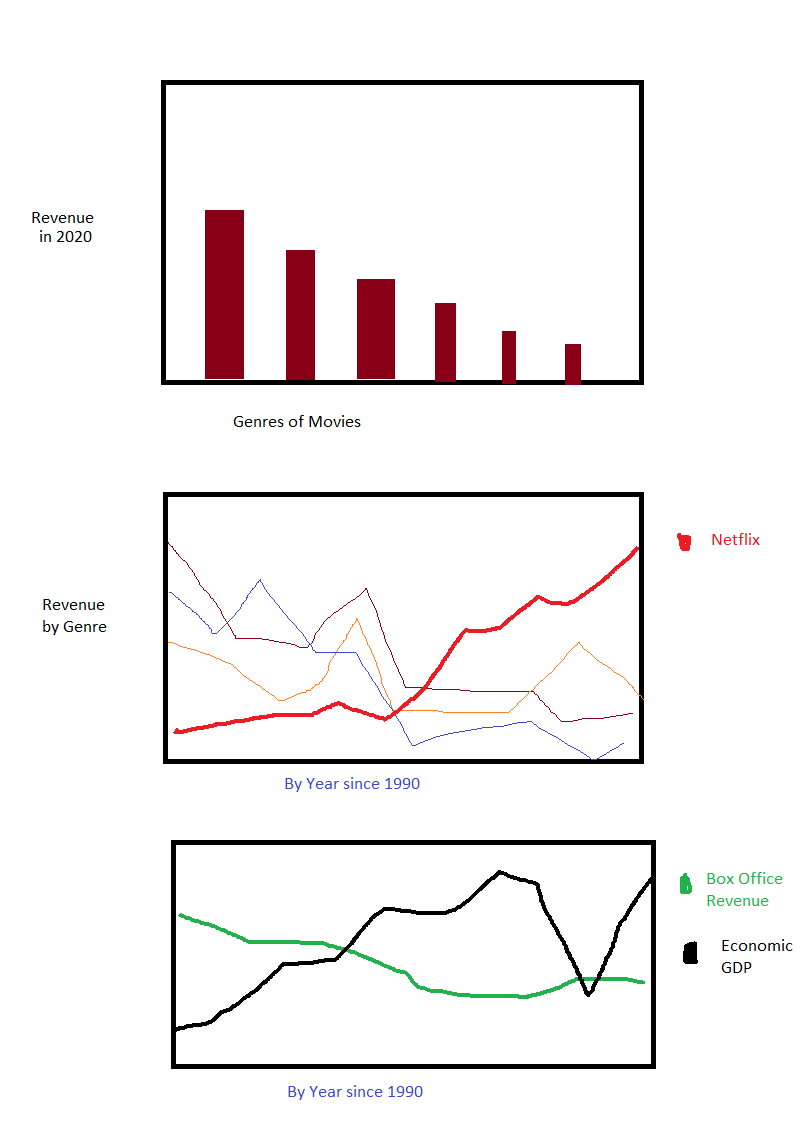
This sketch was created in Paint in about 15 minutes. These are sketches for a hypothetical project on the box office revenues of movies. The project is attempting to show correlation between box office revenues, Netflix earnings, and America’s GDP.
Do not be fooled! This sketch represents C- quality work. The sketches illustrate a few things that should be addressed early. Before submitting this Organization Deliverable, the sketches should be updated to address these shortcomings:
- There are only 3 plots. Ouch!
- The y-axes are not all labeled.
- The bar chart showing genre of movies does not add any value to the research question. It is good that the bars are sorted by value, but there is no point to the chart.
- Lacking annotation. The bar chart could have values added to the top of the bars (or inside the bars). The line plots could highlight inflection points.
- Needs more creativity. Having only barchart and line plots is not enough. While line plots are fantastic at identifying correlations, there are other plots and activities that are great at showing correlation. The following example correlation methods may not be appropriate given the data collected or my research question. Regardless, here are some other methods:
- Correlation Heatmap
- Machine Learning and Feature Importance
- Plotting Netflix vs GDP and then adding Statistical information such as
Coefficient of Determination.
- The graphs do not sufficiently deter critical counter arguments. For example, even though there is a negative correlation between Box Office revenue and Netflix earnings, we could show that other popular streaming services do (or do not) correlate.
There are some positive realizations from doing these sketches that will impact my project’s efforts:
- I need data by year
- I need to be able to do
twinxplots–to plot lines with different scales on the same axis
GitHub Project
Your code is expected to be delivered on GitHub.
The code must run from a new clone from GitHub with an explanation in the README.md file explaining the steps to run the code locally.
You must follow the structure found in the template project. The GitHub project has several important folders and files describe below.
Folders
You must make use of the Folders provided:
-
data_organized: This will contain data that is small enough for consumption and ready to be plotted. If the raw data from the data sources is dirty or too big for quick and repeated consumption, you need to reduce, normalize and organize the data first. Store the raw data in the raw_data folder. After you’ve cleaned and organized it, save the processed data into this folder. However, if the raw data is clean and small enough, and it does not need any preprocesssing, you can store the raw data here. -
plots: All of your generated plots need to be saved here. It should contain only images. -
raw_data: Dirty data goes here. For any very large datasets (>1GB) do not upload it. Instead, provide a link to a shared Google Drive that contains all of your raw data. -
test_data: If you do a lot of data organization, you will want to test your code with test data. Store that test data here. Furthermore, in some uncommon cases you will have plots that will need to be “tested” by plotting fake (or test) data.
Files
You must make use of the Files provided:
-
mach_learning.py: If you are doing the Machine Learning challenge, create and train your models in this file. Be ready to do more than just create a model. -
main.py: Create amazing plots in this file. You will read the data fromdata_organized(unless your raw data required no reduction, in which case you can read your data fromraw_data). You will do plot-related work such as joins, column filtering, pivots, small calculations and other simple organizational work. -
preprocess_data.py: This file is intended to do the following types of work:- download data from APIs
- screenscrape data from websites
- reduce the size of large datasets to something more manageable
- clean data: reduce/rename columns, normalize strings, adjust values
- generate data through relatively complicated calculations
-
README.md: This file contains instructions to explain the extended files & folders in your project. Also, if some/all of your project will not run from GitHub, provide instructions for how to setup and run your code locally. Ideally, only some parts of your project would require custom setup while the rest will run without changes. -
run_tests.py: This is the entry point to running all of your tests. You can do simple testing as we have done all year in your homework assignments. Or, you can leverage Python’s Unit Test Framework which is a bit more complicated, but super cool.
Preprocessing Data
To reduce processing time you should save your processed data into the folder ‘data_organized’. You can do this with: df.to_csv('data_organized/filename.csv')
You will spend a surprising amount of time in this area. You will be much more successful if you can complete this early.
You may have additional helper files besides preprocess_data.py, but, this file should be the entry point for that activity.
You should test this file’s code in run_tests.py.
It is possible that your raw data is small and uncomplicated. In which case, this file will do (virtually) nothing. You can
Each file has a header comment that explains what code belongs in each file. These files should have the main-method pattern to allow one to execute that functionality only.