Exploring Advanced Data Visualizations for Research Projects
Objective:
Create advanced data visualizations that effectively communicate complex data insights, moving beyond basic line or scatter plots.
Directions:
- [10 mins] - Explore various visualizations
- [10 mins] - Join a group of 3 or 4 students
- Analyze the data set and research question to identify key insights.
- Select an advanced visualization type (do not choose a line or scatter plot) that best represents the data and supports the research question (you may do more than one)
- Sketch a draft of the chosen visualization.
- Prepare a brief explanation why you chose this view and why the selected visualization is more effective than basic plots.
- [XX mins] - Review with Teacher
Visualization Resources
- Data Visualization Catalogue
- Seaborn examples
- How to Choose the Right Data Visualization
- NCHS Data Visualization Gallery
- Data Viz Project
- NCHS-CS website on visualizations
Dataset Descriptions
Choose one of these data sets (or you can work with your own research project idea).
Data Set 1 - Global Renewable Energy Consumption
- Research Question: How has the share of different renewable energy sources evolved globally over the past two decades, and what trends can be observed?
- Data Description: This data set includes annual global consumption figures for various renewable energy sources (e.g., solar, wind, hydro, geothermal) from 2000 to 2020.
Data Set 2: World Population Age Distribution
- Research Question: What are the comparative age distributions across different continents, and how do they relate to regional socio-economic factors?
- Data Description: This data set provides population counts segmented by age groups (e.g., 0-14, 15-24, 25-54, 55-64, 65+) for each continent as of 2020.
Possible answers (view after completing above activity)
Data Set 1: Global Renewable Energy Consumption
Research Question: How has the share of different renewable energy sources evolved globally over the past two decades, and what trends can be observed?
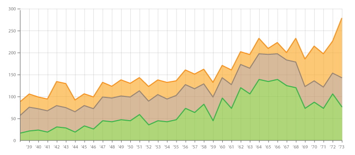
Stacked Area Chart:
- Purpose: Illustrates the cumulative contribution of various renewable energy sources over time, highlighting both individual and collective trends.
- Example: A chart displaying the global energy consumption from 2000 to 2020, with each segment representing a different renewable source (e.g., solar, wind, hydro). This visualization emphasizes the growth patterns and shifts in energy source prominence.
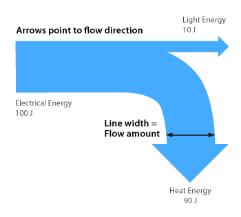
Sankey Diagram:
- Purpose: Demonstrates the flow and proportion of energy consumption from different renewable sources, providing insight into the distribution and transition of energy usage.
- Example: A diagram mapping the journey from various renewable energy sources to their respective consumption sectors, effectively showcasing the magnitude and direction of energy flows.
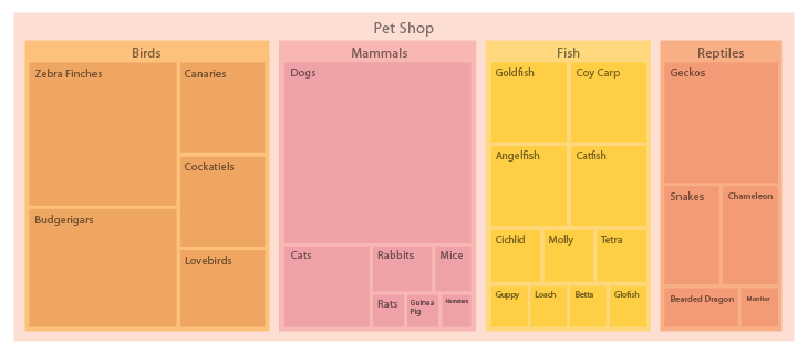
Treemap:
- Purpose: Offers a hierarchical view of the proportionate contributions of each renewable energy source within the total energy consumption.
- Example: A treemap where each rectangle’s size corresponds to the consumption level of a specific renewable source, allowing for quick comparison of their relative magnitudes.
Data Set 2: World Population Age Distribution
Research Question: What are the comparative age distributions across different continents, and how do they relate to regional socio-economic factors?
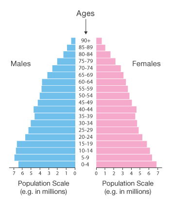
Population Pyramid:
- Purpose: Visualizes the age and gender distribution within a population, facilitating comparisons between different regions.
- Example: Side-by-side pyramids for continents like Africa, Asia, and Europe, highlighting differences in age structures and potential socio-economic implications.
Heat Map:
- Purpose: Represents the density of specific age groups across various continents using color gradients, making patterns and concentrations easily identifiable.
- Example: A heat map where age groups are plotted against continents, with color intensity indicating the population size within each age bracket.

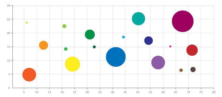
Bubble Chart:
- Purpose: Combines age distribution data with another variable, such as GDP per capita, to explore potential correlations.
- Example: A chart where each bubble represents a continent; the bubble’s position indicates the median age, its size reflects the population under 15, and the color denotes GDP per capita, revealing insights into the relationship between age distribution and economic factors.
These visualization techniques can provide deeper insights into this data and move beyond basic plots to more effectively communicate complex relationships and trends.