Regression - Distance Study
In this study, we will use Machine Learning to create a model to predict the distance a person can throw a baseball.
Predicting Distance
In this hypothetical example, we will use the data found in the Distance Case Study please go to that page to view and learn more about the data. To summarize, the data provides a distance of how far a person can throw a baseball. The features include: age, gender, and sport.
Since we are predicting distance, a real number, we need to use a model that does Regression. Examine all the tabs below to see the Data, Code, the results of our two models, and graphs of the models’ predictions.
Summary
The graphs presented in the Model Graphs tab are most insightful. It provide a lot of information about how the model makes predictions. While MSE values help us to determine that the LinearRegressor is better at making predictions, it is a far, far cry from providing real value.
Listing out the Coefficients and Feature Importance helps us understand what features are making the biggest impact on the predictions. But, again, the real value comes from the Model Graphs.
-
Please look at the Distance Case Study. Here is a scatter plot of all the data and we can see it pretty messy. There are some patterns one can extract, but very little is obvious.
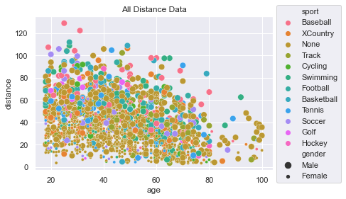
Code to generate plotsns.scatterplot(x=df['age'], y=df['distance'], hue=df['sport'], size=df['gender']) plt.title('All Distance Data') plt.legend(loc='upper left', bbox_to_anchor=(1.0, 1.1)) -
df, features, labels = load_data() print('LinearRegression Info') model = model_regression(features, labels, linear=True) show_coefficients(model, features) print('\nDecisionTreeRegressor Info') dtm = model_regression(features, labels, linear=False) show_importance(dtm, features) -
Let’s look at the
MSE(Mean Squared Error) for both theLinearRegressorand theDecisionTreeRegressor. We see that LinearRegressor is much better on average with an MSE = 274 while the DecisionTreeRegressor has MSE = 453.We can see from the Coefficients determined in the LinearRegressor that the male gender throwing prediction is 17.7 farther. Those who play baseball are given 15.3 boost and those who do no sport at all are reduced by 6. For each year you age, you lose about 0.47.
The DecisionTreeRegressor reveals how important it thinks each feature is. The most important to the model is
ageat 50%, thengenderat 29%, followed by Baseball, None, and Track dummy features.The
LinearRegressoris much more transparent in how it does its predictions. Approx:
$dist = 54 + 17 \times male - 0.46 \times age + 15 \times Baseball + 4.9 \times Football - 6 \times None - …$ -
LinearRegression Info
MSE : 273.95
Intercept: 54
male : 17.787
age : -0.466
sport_Baseball : 15.329
sport_Basketball : -0.119
sport_Cycling : -1.767
sport_Football : 4.918
sport_Golf : -1.514
sport_Hockey : 0.182
sport_None : -6.140
sport_Soccer : -2.176
sport_Swimming : -3.630
sport_Tennis : -1.729
sport_Track : -1.290
sport_XCountry : -2.064DecisionTreeRegressor Info
MSE : 452.93
Feature: male, Importance: 28.59%
Feature: age, Importance: 50.04%
Feature: sport_Baseball, Importance: 4.48%
Feature: sport_Basketball, Importance: 1.27%
Feature: sport_Cycling, Importance: 1.05%
Feature: sport_Football, Importance: 0.71%
Feature: sport_Golf, Importance: 1.00%
Feature: sport_Hockey, Importance: 0.21%
Feature: sport_None, Importance: 3.28%
Feature: sport_Soccer, Importance: 1.60%
Feature: sport_Swimming, Importance: 1.86%
Feature: sport_Tennis, Importance: 1.83%
Feature: sport_Track, Importance: 2.27%
Feature: sport_XCountry, Importance: 1.83% -
To get an truly insightful understanding of how a model is make its predictions, it is handy to make a graph of the predictions from the features. For example, below you’ll see how the LinearRegressor predicts that women who play baseball can throw farther than men who do no sports at all.
To generate these graphs, we had to create a
DataFramewith all possible combinations of the features and then do a prediction. The predictions are graphed here: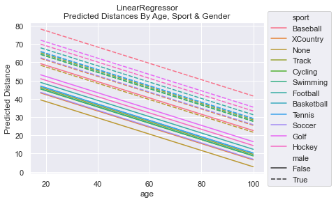
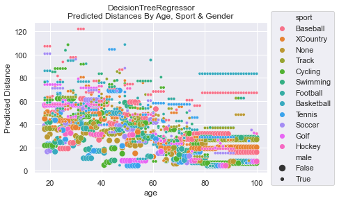
NOTE: The DecisionTreeRegressor was not bounded when learning. The complexity of the predictions could have been simplified and, perhaps, the MSE could have been reduced if we had optimized max_depth via hyperparameter tuning. For simplicity, we did not do this. Having the complexity also helps establish that the model output was quite complicated and likely represented some over fitting.
Code to create graphs
def create_all_features():
    # lets create a set of data to make predictions on
    # get all ages for each sport and gender
    sports = df['sport'].unique()
    ages = [ age for age in range(18, 101) ]
    genders = [False] * (len(ages)*len(sports))
    gender_m = [True] * len(genders)
    genders.extend(gender_m)
    # replicate ages to be for all sports (multiply by number of sports)
    # then, double itself to get both genders
    all_ages = []
    for i in range(len(sports)):
        all_ages.extend(ages)
    all_ages.extend(all_ages)
    # replicate sports to be for all ages (multiply by number of ages)
    # then, double itself to get both genders
    all_sports = []
    for i in range(len(ages)):
        all_sports.extend(sports)
    all_sports.extend(all_sports)

    # create the dataframe structured like original features during training
    df_features = pd.DataFrame({'male':genders, 'age':all_ages, 'sport':all_sports})
    return df_features

def graph_linear_predictions(features):
    # View the predictions made by LinearRegressor
    # make some predictions and graph them!
    # sport is categorical data. We definitely need to get_dummies!
    df_dummified_features = pd.get_dummies(features)

    label_predictions = model.predict(df_dummified_features)

    sns.lineplot(x=features['age'], y=label_predictions, hue=features['sport'], style=features['male'])
    plt.title('LinearRegressor\nPredicted Distances By Age, Sport & Gender')
    plt.legend(loc='upper left', bbox_to_anchor=(1.0, 1.1))
    plt.ylabel('Predicted Distance')

def graph_dtr_predictions(features):
    # View the predictions made by DecisionTreeRegressor
    # make some predictions and graph them!
    # sport is categorical data. We definitely need to get_dummies!
    df_dummified_features = pd.get_dummies(features)

    label_predictions = dtm.predict(df_dummified_features)

    sns.scatterplot(x=features['age'], y=label_predictions, hue=features['sport'], size=features['male'])
    plt.title('DecisionTreeRegressor\nPredicted Distances By Age, Sport & Gender')
    plt.legend(loc='upper left', bbox_to_anchor=(1.0, 1.1))
    plt.ylabel('Predicted Distance')