Read through the description for the Curve of Best Fit
Complete the TODO in the code below and show the correct plot output to complete this activity.
import random
import seaborn as sns
import matplotlib.pyplot as plt
import numpy as np
from sklearn.metrics import mean_squared_error
def add_inset_text(fig, position, actual, coeffs):
# print values in an inset positioned in figure percentages [x, y, width, height]
ax_inset = fig.add_axes(position)
ax_inset.set_xlabel('')
ax_inset.set_ylabel('')
ax_inset.set_xticks([])
ax_inset.set_yticks([])
ax_inset.grid(False)
text = 'Coeff Actual vs Pred'
ax_inset.text(0.05, 0.90, text, ha='left', va='top', fontsize=14)
text = ''
for a, c in zip(actual, coeffs):
text += f'{a:.2f} vs {c:.2f}\n'
ax_inset.text(0.18, .70, text, ha='left', va='top', fontsize=12)
return ax_inset
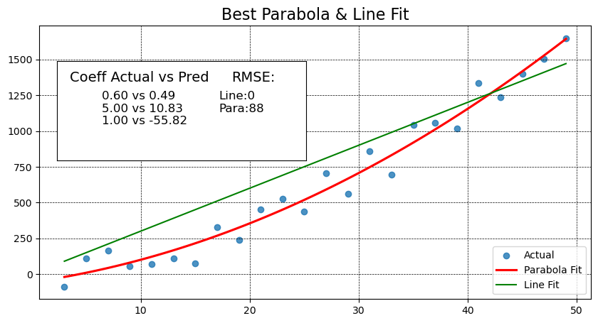
def best_parabola_fit():
def parabola(x, a, b, c):
y = a*x**2 + b*x + c
return y
def generate_points(a, b, c, noise):
x_data = [ x for x in range(3, 50, 2) ]
y_data = [ parabola(x, a, b, c) + random.randint(-noise, noise) for x in x_data]
return x_data, y_data
# establish our True parabola coefficients
actual = (0.6, 5, 1)
noise = 150
x_data, y_data = generate_points(*actual, noise)
# plot it all
fig, ax = plt.subplots(figsize=(10,5))
# Use the grid in the plot and set the line style to black & dashed
plt.grid(True, linestyle='--', linewidth=0.5, color='black')
# Eliminate the confidence interval shading of the parabola and color the line red
sns.regplot(x=x_data, y=y_data, ax=ax, order=2, ci=None, line_kws={'color':'red'})
# Determine if a linear line is a better fit using MSE
# find the coefficients of the parabola that best fits the points generated
# The coefficients are ordered from high order to lower order
coeffs_2 = np.polyfit(x_data, y_data, 2)
y_predicted_2 = [ coeffs_2[0]*x**2 + coeffs_2[1]*x + coeffs_2[2] for x in x_data]
mse_degree_2 = mean_squared_error(y_data, y_predicted_2)
# get coefficients for the line
# TODO: similar to above - get the coefficients for the line,
# then calculate the predicted y values and MSE for the line,
# and print out the RMSE for both the line as well.
y_predicted_1 = [ 30*x + 1 for x in x_data] # Change to use np cooefficients here when you get them
mse_degree_1 = 0 # Change to calculate MSE for the line here when you get the coefficients
print('RMSE Degree2:', np.sqrt(mse_degree_2), ' RMSE Degree1:', np.sqrt(mse_degree_1))
# add MSE to our inset text box
ax_inset = add_inset_text(fig, [0.15, 0.50, 0.35, 0.28], actual, coeffs_2)
ax_inset.text(0.7, 0.90, 'RMSE:', ha='left', va='top', fontsize=14)
text = f'Line:{np.sqrt(mse_degree_1):.0f}\nPara:{np.sqrt(mse_degree_2):.0f}'
ax_inset.text(0.65, .70, text, ha='left', va='top', fontsize=12)
# since plt.plot() does not offer ax=ax argument, and without it we plot on the inset,
# use ax.plot() to get the line to show up on the right axis.
ax.plot(x_data, y_predicted_1, color="green")
ax.set_title('Best Parabola & Line Fit', fontsize=16)
# Need to set the legend on the axis to get things to show up correctly,
# even when setting label=''values' during plots, we need to set the label strings here.
ax.legend(['Actual', 'Parabola Fit', 'Line Fit', ], loc='lower right')
best_parabola_fit()RMSE Degree2: 88.35854461478638 RMSE Degree1: 0.0